Some tools feel great, like they are a part of you. Other tools somehow never reach that capacity, even after many hours of use and a complete understanding of their workings. Let’s talk about that.
In Sofian Audry’s excellent Art in the Age of Machine Learning, they reference Heidegger’s concept of something being “ready-to-hand” (I promise, this doesn’t get too philosophical.)
This is, in broad strokes, the condition of an entity that allows it to stop being something external to us. Rather, something that’s “ready-to-hand” becomes a part of us during use. The example often quoted is that of a hammer. In our hand, the hammer ceases to feel like a distinct part of the external world but rather feels like a part of ourselves.
Heidegger also outlines three main ways an entity can be considered “unready-to-hand”. It can be conspicuous (damaged), obtrusive (incomplete), or obstinate (the entity itself is a hindrance to our goal.)
This term, “ready-to-hand”, turns out to be exactly the concept I’ve been looking for when trying to describe my interests in the world of interaction design. Our digital experiences are mediated exclusively by external tools that land all over the spectrum of “readiness”. Ready tools are a joy to use, making their wielders feel capable and empowered. Unready tools are a source of daily frustration. What qualities encourage readiness?
Tools that feel ready-to-hand are ones that feel like they disappear when I’m using them. These are (for me):
Tools that are unready-to-hand often feel like they’re getting in my way, even after I’ve been using them for years. Examples include:
While digital tools can suffer from the conspicuous and obtrusive aspects of unreadiness, I think more often we come across tools that feel obstinate and opposed to our use, drawing us out of the state of “flow” that is so enjoyable for us.
I think what makes a tool ready-to-hand comes down to three primary aspects:
Let’s talk about these one at a time.
1. alignment of intent
This is most easily described with the point-of-sale system example (I used to work as a cashier, so I do have some expertise here.)
Self-checkout systems serve two masters (or maybe even three). They are first and foremost beholden to the company employing them, and so theft prevention is a top priority. This is why they often have cameras, sensitive and flaky scales, and randomly select you for “assistance” to check that you aren’t stealing. In second place, they serve the customer, and provide the bare essentials to scan your items (slowly). A potential third audience is the self-checkout attendant, who has a few different needs from the tool, the primary one of which is to dismiss the interruptions that the POS system adds to the checkout process.
What makes cashier-oriented POS systems different is that the needs of the cashier and the designers of the system are totally aligned. Both want the cashier to be able to enter items accurately at speed. This alignment of intent drives the designers to satisfy the needs of the cashier.
2. consistency
Here we can talk a little about vim (or
emacs, or grep, or one of any number of other
venerable CLI tools.) These tools are done. Little further
development is necessary, and so one feels confident using them wherever
they are available (despite the occasional difference between installed
versions, like the BSD and GNU utilities.)
vim (mostly) behaves as you expect it to, even when it’s
vi or nvim. It is in this pursuit of
consistency that enthusiasts have crafted vim keybinding
extensions for every editor worth its salt, and even web browsers and
shells (set -o vi anyone?)
In contrast, consider the outcry from dedicated users of a website or tool at the prospect of any UI redesign. Yes, sometimes a UI redesign is necessary and results in a tool becoming more ready. That increase in readiness must be worth the trade-off caused by the inconsistency of the redesign.
It’s possible to update a tool without heavily impacting how
ready-to-hand it is, and the rule is simple: the core interactions must
remain consistent. This focus is what has allowed neovim to
grow and take market-share from classic vim. Even though
many changes have been made, the core interactions feel the same.
3. capacity for muscle memory
This is closely linked to the above quality, but distinct in important ways. I begin here with the hot take: all pointing interfaces fail to adequately leverage muscle memory. By “pointing interface” I mean touch screen and mouse interfaces in which the primary interaction is identifying an element and tapping/clicking it with a 2D capable device.
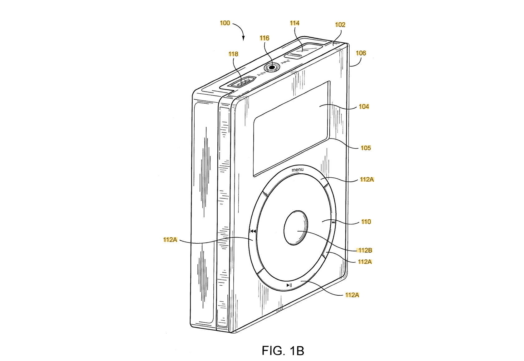
Consider the experience of driving a car. A car is a tool that rapidly becomes “ready to hand” for serious users. And it does so because almost the entire interface is reliant upon muscle memory. Musical instruments benefit from the same. And, I posit, so do some interfaces. Keyboard driven interfaces, scrolling interfaces like the original iPod, and gestural interfaces like many smartphone applications (where you may swipe between states and views) are all interfaces that benefit from muscle memory.
Most pointing interfaces cannot leverage muscle memory because they lacks consistency; the size and position of interactive elements depends on window size and position.
Smartphone applications are the exception that proves the rule - the only tools that feel ready-to-hand on smartphones in my experience are those that place elements in consistent places and (ideally) leverage gestures. A perfect example of this is the phone’s keyboard interface. By positioning itself in exactly the same place every time, you can develop a muscle memory that lets you type accurately without looking (though yes, a physical phone keyboard like that of the iconic Nokia N900 would be more accurate, not to mention just way cooler.)
These aren’t all-or-nothing aspects. Some tools require pointing-interfaces, but are still able to be ready-to-hand by leveraging the other aspects. Excalidraw comes to mind, as do some of the top-tier graphical editing interfaces like Photoshop (check out how many professional designers use tablets as input devices though (why? The muscle memory.)
I think that as a designer of tools, our primary responsibility is to understand these aspects of our creations. There are no shortcuts to making tools that feel “ready-to-hand.” But I do think that we can avoid some of the obstacles on our way there, by understanding what affects the feeling of our tools rather than thinking only of their capabilities or their visual design. If you’re seeing low adoption, no love from your users, frustration online about how “clunky” your tools feel, consider their consistency, their alignment with the intent of the user, their capacity for muscle memory.
If you’re working on tooling, and the above is interesting to you, maybe talk to me.